ROLE
UX Designer
TIMELINE
09/25 - 03/26
PLATFORM
iOS Mobile
STATUS
Beta version shipped and publicly available

As the sole designer on the beta release, I took Rypil from initial concept to a live iOS app on the App Store. I established the 0-to-1 design system from scratch and designed the core screen flows required to validate our core product experience with real users.
Key Deliverables
Scalable iOS Design System (Tokens, Components, Foundations)
Core End-to-End User Flows (Onboarding, Login, Choosing cause, Card setup, Home screens)
Developer Handoff Assets & App Store Marketing Screens


#1
Brands struggle with consumer fatigue and find it difficult to authentically engage customers.

#2
Traditional affiliate and reward structures fail to build lasting loyalty grounded in shared values.
#3
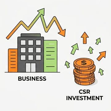
Businesses lack a scalable way to convert CSR investment into measurable business growth.
When I joined the Rypil team, the product was still taking shape. We had been collecting ideas and possibilities on a shared Mural board.
Before designing, I spent time understanding what was already there, what the team was envisioning, and where the experience could grow. This became the starting point for shaping the beta experience and building a more consistent design foundation.

Colors
Red

Teal

Orange

Blue

Yellow

Purple

Green

Pink

Teal Overlays

Grey

Teal Overlays (Light Background)

Teal Overlays (Dark Background)

Gradients

Tokens
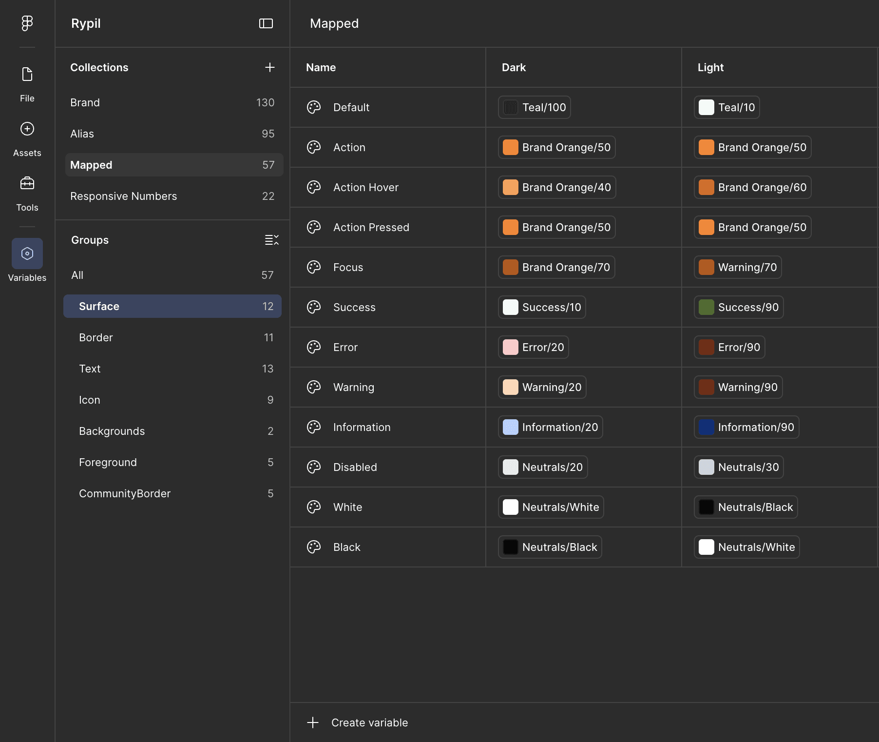


Typography
Mobile | Tablet | Desktop

Tokens

Icons

Buttons
Dark Appearance

Light Appearance


Other Components

Screens


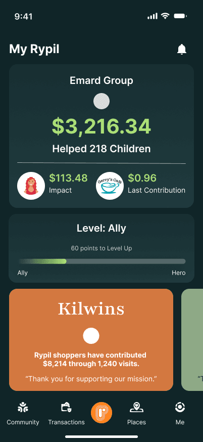


What I built
Typography system
with defined type styles and hierarchy
Number system
for consistent sizing, spacing, and other numerical values
Iconography
with a consistent visual style and sizing
Reusable components
such as buttons, cards, inputs, navigation elements, and other UI patterns
Component states and variations
to account for different interactions and use cases